Escape the Office
Who is this Sarah person?
- Dojo 2 widgets
- accessibility
- herds cats
Typescript is a design tool
Design?

Who are you designing for?
- Your future self
- New contributors to your code
- Developers consuming your code as a library
How will they interact
with your code?

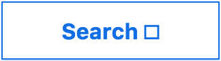
An icon button case study:
 •
•
 •
•

Requirements:
- The icon is optional
- Alt text is necessary if the icon adds meaning
- There is a predetermined set of possible icons
Caveman Coder

I want it to "just work"
Take 1:
							interface ButtonProperties {
							  label?: text;
							  iconType?: string;
							  iconAltText?: string;
							}
							w(Button, {
							  iconType: 'search'
							});
								<button>
								  <svg role="img">
								    <use xlink:href="#search"></use>
								  </svg>
								</button>
Yes, this looks right. I am done here.
Take 2:
						interface ButtonProperties {
						  label?: string;
						  icon?: {
						    type: string;
						    altText: string;
						  };
						}
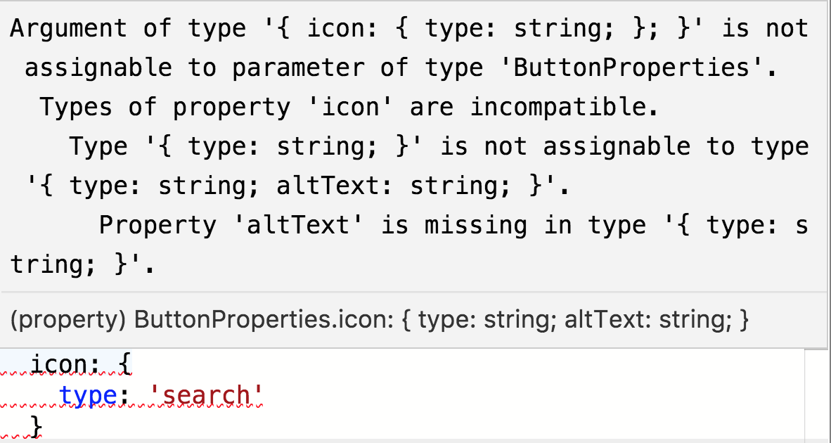
Fine, I will smash my keys until this error goes away
						w(Button, {
						  icon: {
						    type: 'search',
						    altText: 'search'
						  }
						});
								<button>
								  <svg role="img" aria-labelledby="search-title">
								    <title id="search-title">search</title>
								    <use xlink:href="#search"></use>
								  </svg>
								</button>
Intern Horde

Docs? What are docs?
Let's break the button interface
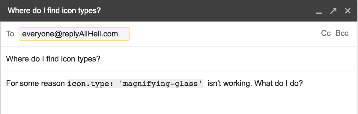
Email Subject: Where do I find icon types?
Body: For some reason icon.type: 'magnifying-glass' isn't working. What do I do?
What would help someone new to your code?
- IntelliSense/code hinting
- A more intuitive way to identify an icon as presentational
From earlier:
						interface ButtonProperties {
						  label?: string;
						  icon?: {
						    type: string;
						    altText: string;
						  };
						}
						w(Button, {
						  label: 'Search',
						  icon: {
						    type: 'magnifying-glass',
						    altText: 'search'
						  }
						});
								<button>
								  Search
								  <svg role="img" aria-labelledby="search-title">
								    <title id="search-title">search</title>
								    <use xlink:href="#magnifying-glass"></use>
								  </svg>
								</button>
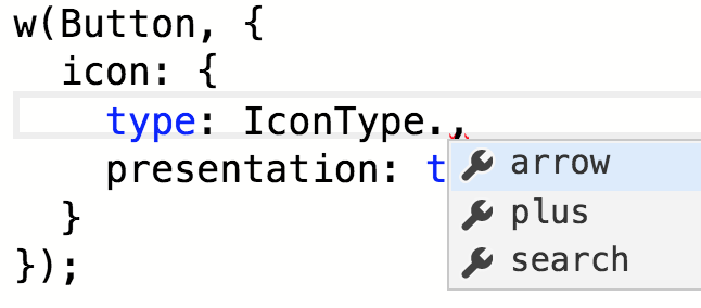
Take 3:
						enum IconType {
						  plus,
						  arrow,
						  search
						};
						interface PresentationIcon {
						  type: IconType;
						  presentation: true;
						}
						interface ContentIcon {
						  type: IconType;
						  altText: string;
						}
						interface ButtonProperties {
						  label?: string;
						  icon?: PresentationIcon | ContentIcon;
						}
Hmmm... one of these looks right
								<button>
								  Search
								  <svg aria-hidden="true">
								    <use xlink:href="#search"></use>
								  </svg>
								</button>
Inventor

I also want it to do
[insert 10 extra features, and a pony]
Flexibility vs. control
First let's talk about aria...
What is a <button>?
- An interactive element that performs an action on the page
- e.g. controlling a popup
- toggling a state
- submitting a form
- ??
typearia-expandedaria-haspopuparia-pressed- ...
Our solution:
						interface ButtonProperties {
						  aria?: { [key: string]: string; };
						  popup?: boolean;
						  pressed?: boolean;
						  type?: 'submit' | 'reset' | 'button' | 'menu';
						}
Back to this guy
Where do you want to preserve control?
- Creating the
<button>element - All event handlers, states, etc.
Where do you expect someone to add functionality?
- Tooltips
- Custom content
- Addons
Extension points:
- getContent(): string | HTMLElement
- renderPopupIcon(): HTMLElement
- render(): HTMLElement
Extending Button:
						interface PonyButtonProperties extends ButtonProperties {
						  ponyDance?: boolean;
						}

						class PonyButton extends Button<PonyButtonProperties> {
							renderIcon() {
								...
							}
						}
Who really knows best?
Escape Challenge!
Create an interface for an optionally hidden label on a text input
Requirements
- A visible label should be able to support custom content, e.g.
<span class="required">*</span> - There must be labelling text, even if invisible
aria-labelis ignored by all common translation services- This may change

					interface TextInputProperties {
					  label: string | HTMLElement;
					  labelHidden?: boolean;
					}
@codingchaos • #TSConf #EscapeTheOffice